.png)
Crafting Loyalty & Community Experiences That Convert
I designed the user experience for Skipper's loyalty and community program with a focus on engaging customers, boosting sign-ups, and maximizing conversion rates as part of their rebrand from Tirtyl.
Client
My Role
duration

Amidst a rebrand from Tirtyl to Skipper, the company decided to introduce a loyalty program (Skip Club) and revamp their existing community program.
This initiative was aimed at strengthening brand loyalty and community bonds by boosting engagement among new and existing customers through an enhanced user experience.


Competitive Advantage: Skipper offers the most extensive range of household and personal care products, positioning them as a market leader.
Complexity of loyalty program: Skipper's program was by far the most complex, posing a potential weakness/threat to acquiring a loyal member base.
Community & Social Impact: Skipper led this space, actively involving their community members in iniatives/events that drove social responsibility.


Stacked Flip Tiles
Users felt surprise & delight with the flip card interaction but wanted to see the benefits upfront.

Accordion
Users liked the accordion but found that having two on the same page wasn't visually appealing.

Horizontal Slider
Users appreciated the reduced scroll length and found the swiping action to be an intuitive and familiar interaction.

Parallax Scroll
Surprisingly, all participants in the user testing, disliked this concept and were confused about how to interact with it.
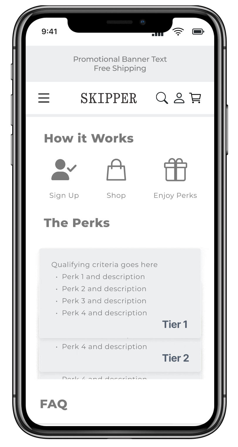
Users want to see membership benefits upfront: They want to be able to locate this information with minimal effort.
It was a hard no to the parallax scroll: None of the participants found this interaction intuitive and did disliked the look of it.
Educating users without impacting conversion: Users like having things explained in very simple terms.
Bottom navigation is second nature: None of the participants even noticed that bottom navigation during logged in state and really liked the feature.
Personalisation is paramount: Users love seeing the impact of their personal contributions and almost expected personalised product recommendations.
Users don't want to work for what they've earned or qualified for: A strong preference for rewards to be automatically added to the shopping cart.
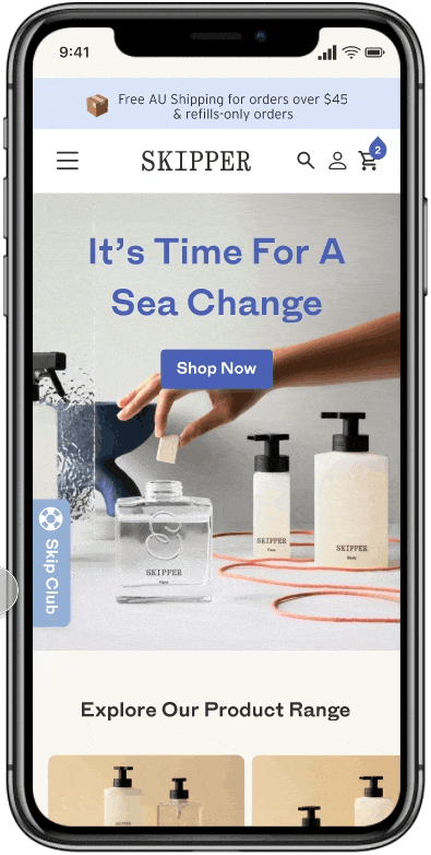
The Skip Club sticky fixed to the edge of the screen during logged out state, offering a subtle visual cue, maximising sign up opportunity, capturing users who don't scroll very far down the page.
Horizontal slider with flip tile interaction for Skip Club membership tiering, minimising user effort.


Personalisation for customers and members through:
Not making users work hard for what they've earned or qualify for by:


After careful consideration, Skipper decided to shift from a membership sign-up process to automatically enrolling anyone who made a purchase in the last 12 months as a Skip Club member.
The elimination of friction from the complex membership tiering simplified the user journey, increased membership organically, and boosted engagement with Skipper’s social and environmental initiatives, fostering a more inclusive community and amplifying social impact.

Time spent refining designs doesn't always guarantee they'll be shipped: Shifting to a simpler solution reinforced the importance of flexibility and embracing the iterative process to meet users' needs.

Social impact is often secondary over product offering: While the aspects of social impact may aligne with users' personal values, it typically isn't the primary reason for driving their engagement with the product.

Fancy features/interactions don't always add delight: Avoid becoming too attached to specific features/interactions, as they may not always have enough appeal to be included in the final design.